R-Programming
drive
v1 <- c(3,8,4,5,0,11)
v2 <- c(4,11,0,8,1,2)
v <- c(3,8,4,5,0,11, -9, 304)

# Sort the elements of the vector.
sort.result <- sort(v)
print(sort.result)

# Sort the elements in the reverse order.
revsort.result <- sort(v, decreasing = TRUE)
print(revsort.result)

# Sorting character vectors.
v <- c("Red","Blue","yellow","violet")
sort.result <- sort(v)
print(sort.result)

# Sorting character vectors in reverse order.
revsort.result <- sort(v, decreasing = TRUE)
BMI <- 	data.frame(
   gender = c("Male", "Male","Female"),
   height = c(152, 171.5, 165),
   weight = c(81,93, 78),
   Age = c(42,38,26)
)
print(BMI)
# Create a matrix.
M = matrix( c('a','a','b','c','b','a'), nrow = 2, ncol = 3, byrow = TRUE)
print(M)
- Descriptive statistics summarizes or describes the characteristics of a data set.
- Descriptive statistics consists of two basic categories of measures: measures of central tendency and measures of variability (or spread).
- Measures of central tendency describe the center of a data set.
- Measures of variability or spread describe the dispersion of data within the set.
Types of Descriptive Statistics
All descriptive statistics are either measures of central tendency or measures of variability, also known as measures of dispersion.
Central Tendency
Measures of central tendency focus on the average or middle values of data sets, whereas measures of variability focus on the dispersion of data. These two measures use graphs, tables and general discussions to help people understand the meaning of the analyzed data.
Measures of central tendency describe the center position of a distribution for a data set. A person analyzes the frequency of each data point in the distribution and describes it using the mean, median, or mode, which measures the most common patterns of the analyzed data set.
Measures of Variability
Measures of variability (or the measures of spread) aid in analyzing how dispersed the distribution is for a set of data. For example, while the measures of central tendency may give a person the average of a data set, it does not describe how the data is distributed within the set.
So while the average of the data maybe 65 out of 100, there can still be data points at both 1 and 100. Measures of variability help communicate this by describing the shape and spread of the data set. Range, quartiles, absolute deviation, and variance are all examples of measures of variability.
Consider the following data set: 5, 19, 24, 62, 91, 100. The range of that data set is 95, which is calculated by subtracting the lowest number (5) in the data set from the highest (100).
provides a wide range of functions for obtaining summary statistics. One method of obtaining descriptive statistics is to use the sapply( ) function with a specified summary statistic.
# get means for variables in data frame mydata
# excluding missing values
sapply(mydata, mean, na.rm=TRUE)
Possible functions used in sapply include mean, sd, var, min, max, median, range, and quantile.
# get means for variables in data frame mydata
# excluding missing values
sapply(mydata, mean, na.rm=TRUE)The t.test( ) function produces a variety of t-tests. Unlike most statistical packages, the default assumes unequal variance and applies the Welsh df modification.# independent 2-group t-test
t.test(y~x) # where y is numeric and x is a binary factor
# independent 2-group t-test
t.test(y1,y2) # where y1 and y2 are numeric
# paired t-test
t.test(y1,y2,paired=TRUE) # where y1 & y2 are numeric
# one sample t-test
t.test(y,mu=3) # Ho: mu=3
You can use the var.equal = TRUE option to specify equal variances and a pooled variance estimate. You can use the alternative="less" or alternative="greater" option to specify a one tailed test.
# independent 2-group t-test
t.test(y~x) # where y is numeric and x is a binary factor
# independent 2-group t-test
t.test(y1,y2) # where y1 and y2 are numeric# paired t-test
t.test(y1,y2,paired=TRUE) # where y1 & y2 are numeric# one sample t-test
t.test(y,mu=3) # Ho: mu=3t-test
- A t-test is a type of inferential statistic used to determine if there is a significant difference between the means of two groups, which may be related in certain features.
- The t-test is one of many tests used for the purpose of hypothesis testing in statistics.
- Calculating a t-test requires three key data values. They include the difference between the mean values from each data set (called the mean difference), the standard deviation of each group, and the number of data values of each group.
- There are several different types of t-test that can be performed depending on the data and type of analysis required.
- qqnorm(): produces a normal QQ plot of the variable
- qqline(): adds a reference line
qqnorm(my_data$len, pch = 1, frame = FALSE)
qqline(my_data$len, col = "steelblue", lwd = 2)
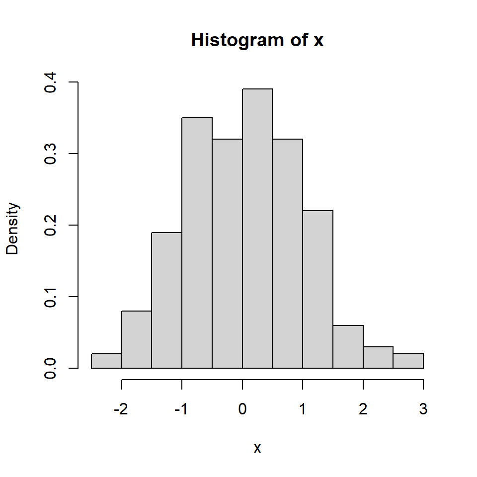
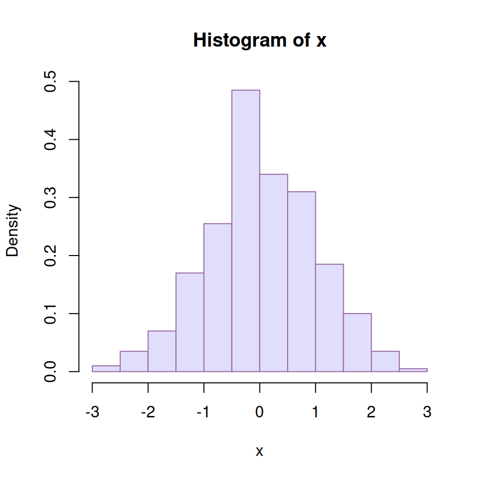
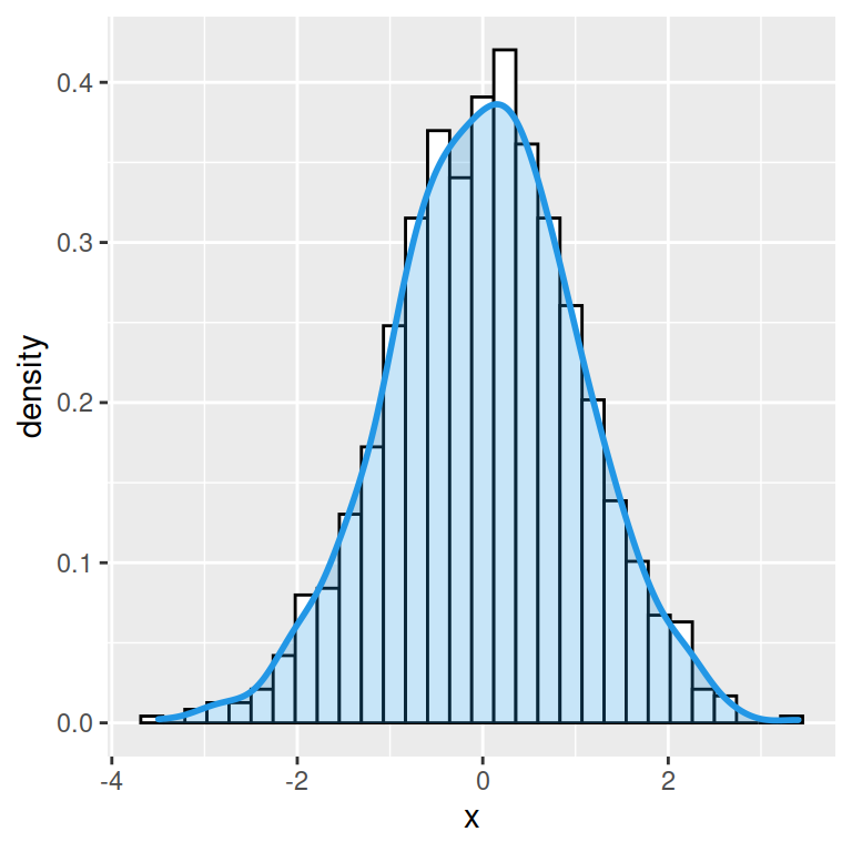
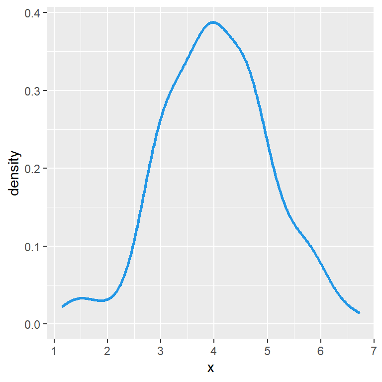
A basic histogram can be created with the hist function. In order to add a normal curve or the density line you will need to create a density histogram setting prob = TRUE as argument.
Histogram with normal curve
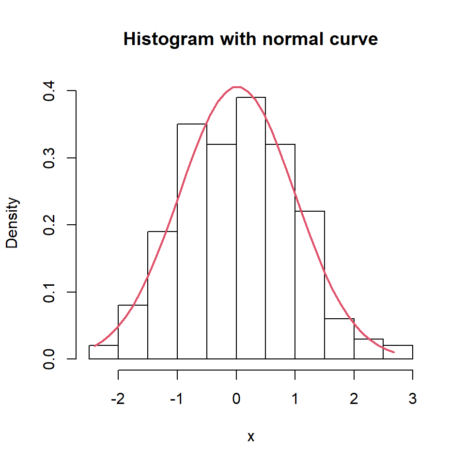
If you want to overlay a normal curve over your histogram you will need to calculate it with the dnorm function based on a grid of values and the mean and standard deviation of the data. Then you can add it with lines.
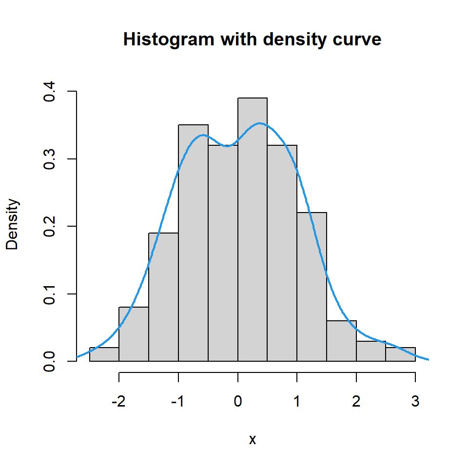
Histogram with density line
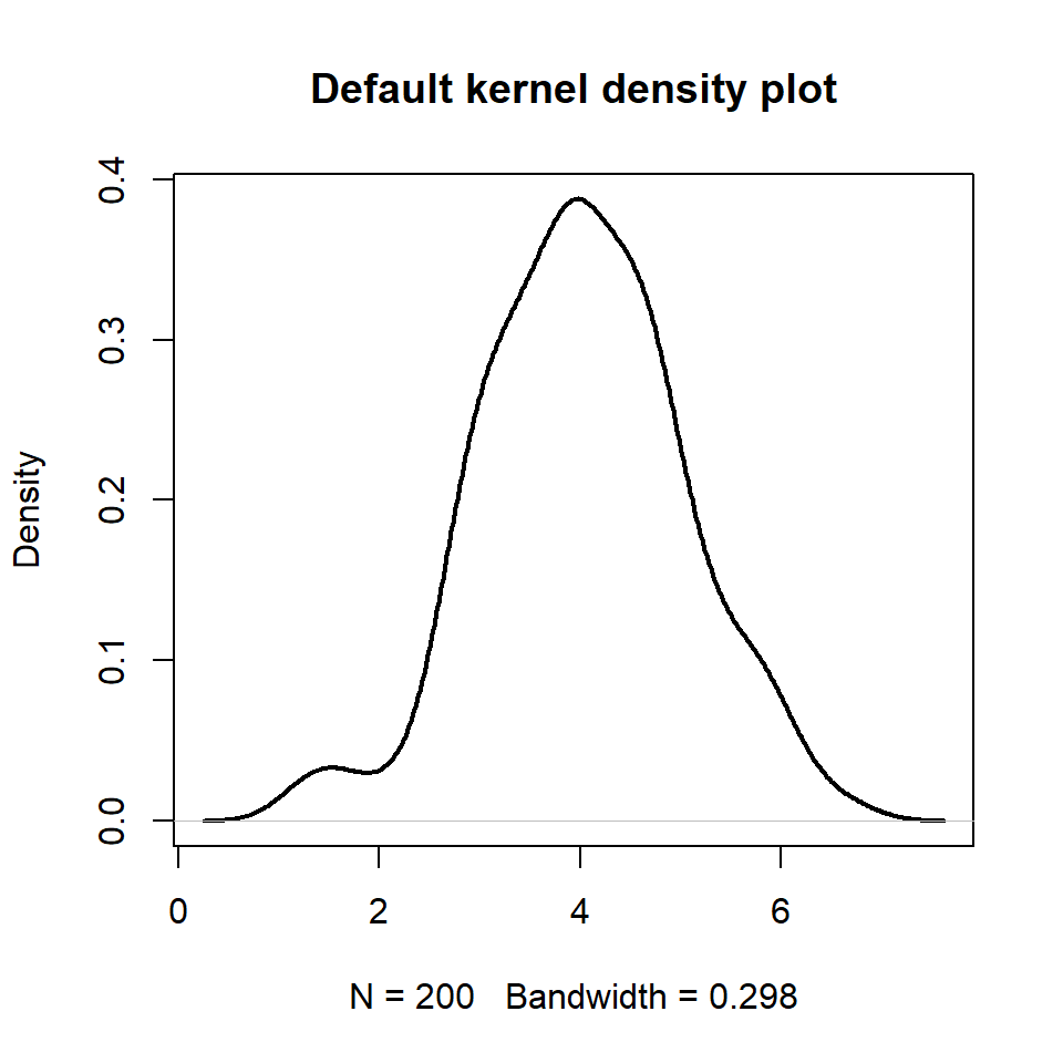
If you prefer adding the density curve of the data you can make use of the density function as shown in the example below.


See also

No comments:
Post a Comment